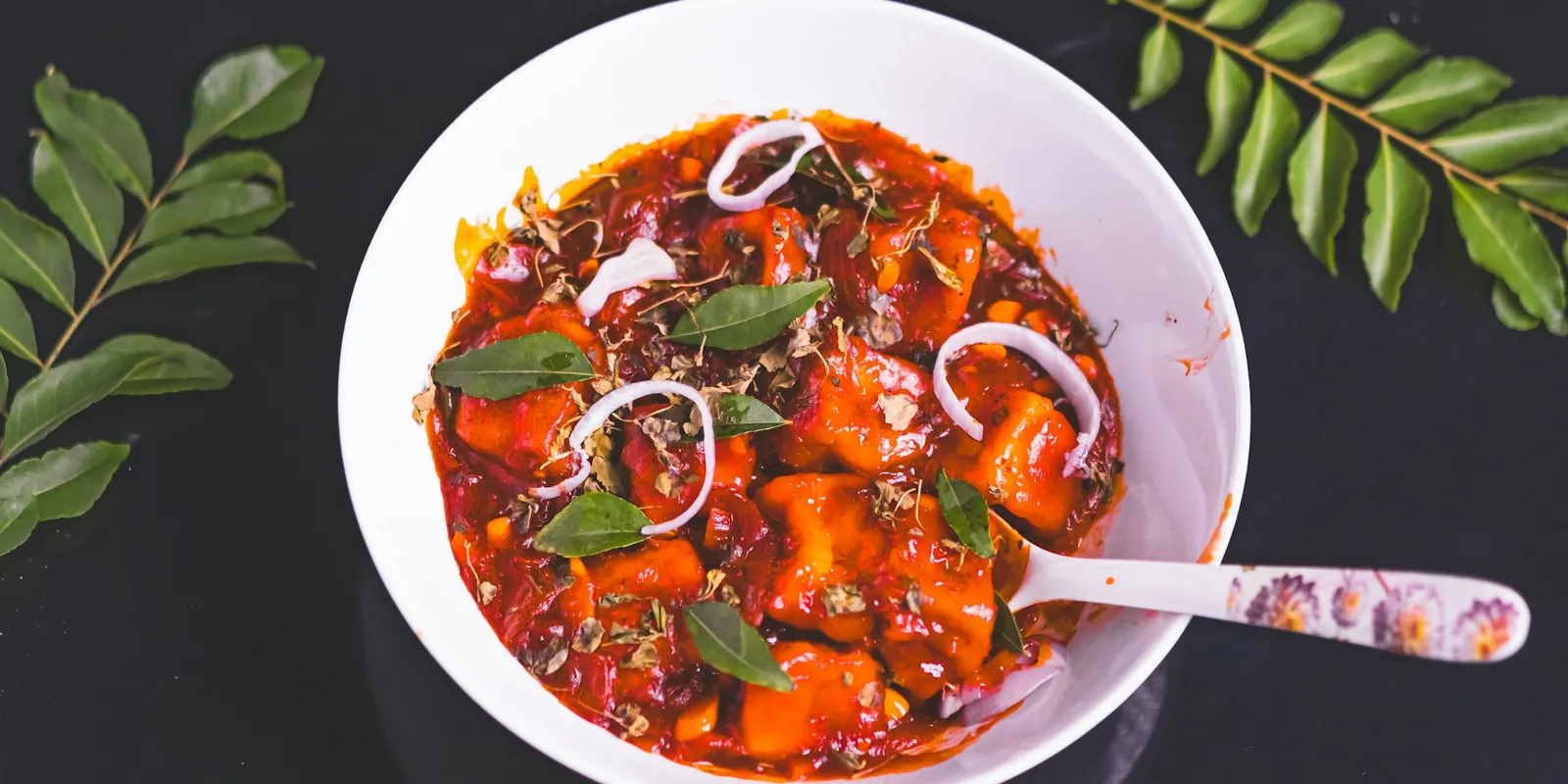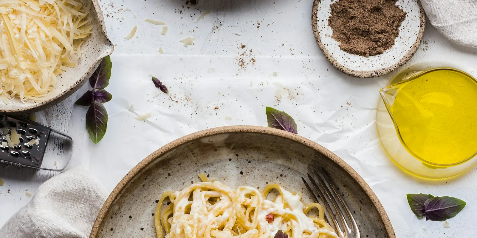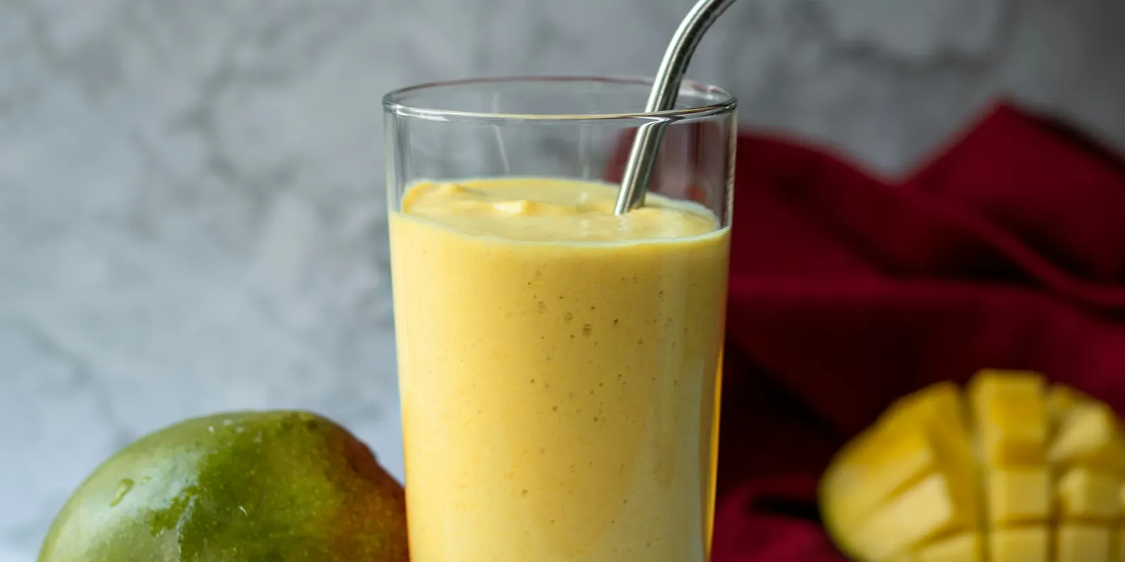
A QR code is the shortest path from "that looks good" to "I'm making that". Someone sees your dish, points their phone, and the full recipe is open. No typing, no searching your profile.
Here's where QR codes work for food creators, and how to make one that looks like you and still scans every time.
1. At the end of your Reels and Shorts
Show the code for two to three seconds on the finished dish. It works for people watching on a TV or laptop, and for anyone who screenshots the frame to scan later.
Say it out loud too: "Scan for the full recipe."
2. In your YouTube long-form videos
Put a corner QR code on screen while you list the ingredients. Viewers watching on a TV (a huge share of YouTube cooking) can't click a description link, but they can scan.
3. On packaging and products
Selling masala blends, pickles or baked goods? A code on the label that opens three recipes using this product turns a one-time buyer into a repeat one.
4. At pop-ups, workshops and markets
A small table sign ("Scan for today's recipe") lets people take the recipe home without you handing out paper. Change which recipe it opens each event and the printed sign still works.
5. On restaurant menus and café tables
If you run or partner with a café, a code next to a dish can open the home version of it. It's great for brand collaborations and for cookbook launches.
6. In print: cookbooks, magazines, flyers
Printed recipes can't show technique. A code next to a tricky step can open a card that links to the exact moment in your video.
7. In brand collaborations
Give sponsors a code that opens your recipe with their product, a discount code and clear disclosure. Then share a report of scans and clicks afterwards. Brands renew creators who show numbers.
Design rules: branded, but scannable
A branded QR code, in your colours with your photo in the middle, gets noticeably more attention than a plain black square. But get the design wrong and phones simply won't read it. The rules:
- Dark code on a light background. Most phone cameras struggle with light-on-dark (inverted) codes.
- Strong contrast. A pale pink code on a white background looks lovely and scans badly.
- Keep a quiet zone, a clear margin around the code. Don't let text or images touch it.
- Logos in the middle are fine, as long as the code uses high error correction, which lets it survive having its centre covered.
- Keep the corner squares clear. Those three big corner squares are how phones find the code.
- Size matters in print. As a rule of thumb, make the code at least 2 × 2 cm, bigger if people scan from further away.
- Always test-scan with two different phones before printing anything.
Nook's QR designer follows these rules for you: palettes that scan, a warning with a one-click fix if your colours are too close, your photo in the centre with high error correction, and sticker or 4:5 poster layouts ready for Stories or print.
Use a link that never breaks
The biggest QR mistake is printing a code that points somewhere temporary: a post you later archive, or a link-in-bio page you later change.
Nook card links and codes never change, even if you edit the recipe, and you can pick a memorable custom link (like usenook.live/MANGO-LASSI) that works in the QR code and when typed.
Measure every scan
Add a campaign tag to each code (menu, market-oct, brand-x) so you can see which placement brings people in. Nook shows views by source, so "the market sign got 300 scans" becomes something you know, not something you guess.
Design your first branded QR code, free: open Studio.